Nankai Group
Nankai Group neededbranding and marketing support for their award-winning Japanese alcohol company.
We take ugly things and make them pretty. Unless you want pretty things to be ugly, because we can do that, too.

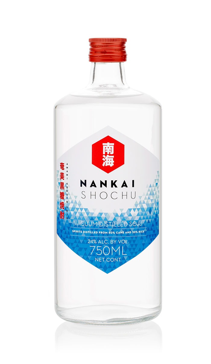
Their flagship product, Nankai Shochu, put Nankai on the map. GOLD Winner at the Los Angeles International Spirits Competition, 2018, and the DOUBLE GOLD Winner at the 2018 SIP Awards.
This label was designed to introduce centuries-old shochu to a new generation of drinkers. We kept the traditional visuals of japan — rising sun, blue ocean — and translated them into a bold geometric design that would stand out on shelves at bars, restaurants, and retail locations.

High-end shochu demands a high-end label. This Japanese tattoo-inspired design was punched onto the label with extravagant gold foil. Each quadrant of the illustration features a different aspect of Amami Island, where the shochu distillery is located: waves, palm leaves, hibiscus flowers, and the dreaded Amami viper.

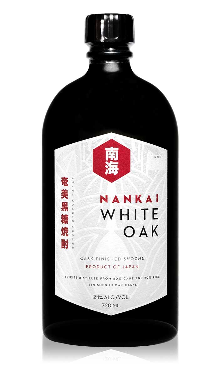
Introducing Nankai White Oak! We are the ecstatic parents of this lovely cask-finished kokuto shochu from Amami Island, Japan. She’s already making us proud with a Double Gold medal at the @sfwspiritscomp. Nankai White Oak is 24% ABV with beautiful notes of vanilla, honey, and green apple. It’s perfect for sipping and even food pairing (fried chicken sandwich).
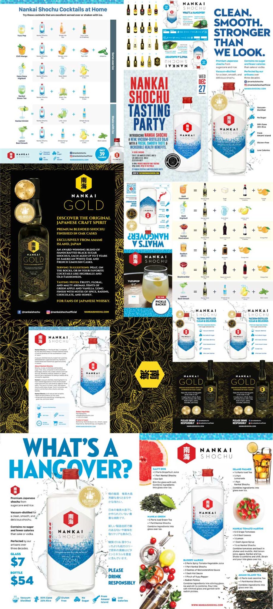
Liquor brands need lots of marketing love and support. From sales sheets to PowerPoint presentations to posters to those cute little folded tents that sit on your table next to the salt and pepper shaker. Here’s a sample of the literally thousands of marketing materials we created for Nankai.
