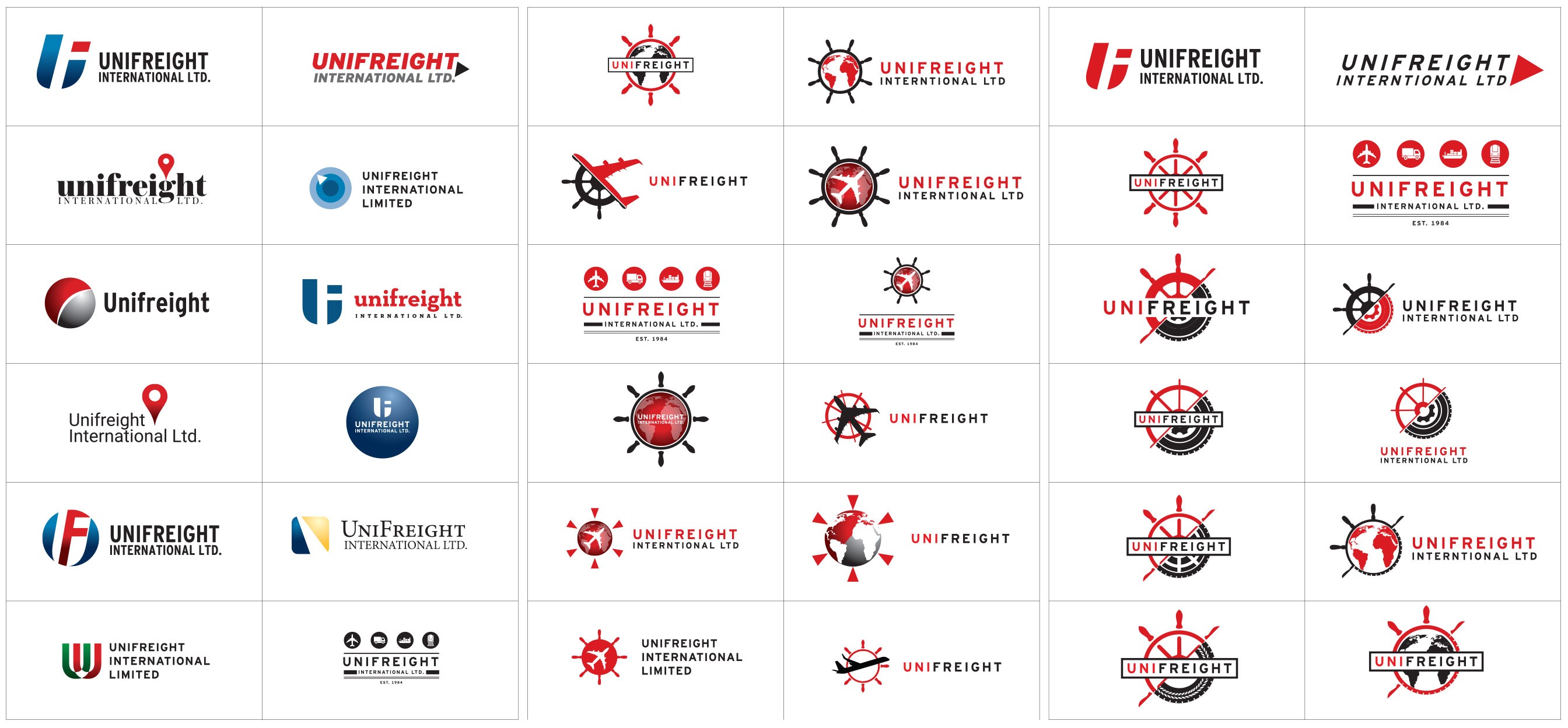
Italian-Canadian shipper, Unifreight International, needed a new logo in an old industry.
Although the new logo is seemingly an effortless update on the old, it actually took weeks to get to that solution. We had to dig deep into the competitors, mock up logos that we knew we didn’t want. We explored all the avenues and options before finally acknowledging that the best solution was to keep the identity of the old logo.
This logo is the perfect example of why simple logos aren’t so simple. When you leave no stone unturned, you grant the client peace of mind. And that’s worth $48,983.
(Editor’s note: we were not paid $48,983.)


