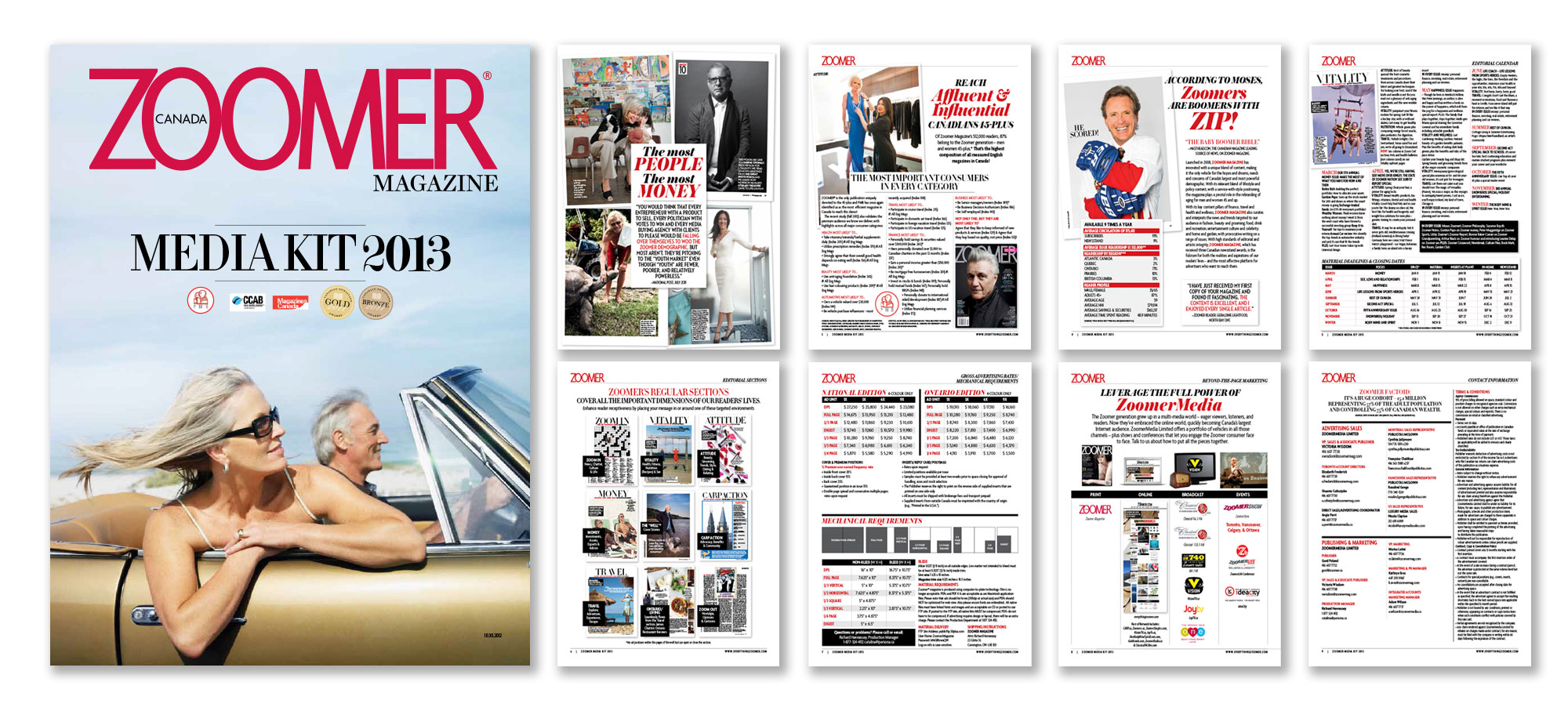
Zoomer magazine is a lifestyle glossy dedicated to the issues of Canadians 45 and up. Upon launching, they needed a logo for the cover and all collateral, one that would be timeless and hold up to the weight of the years.

Logo and Branding
After rejecting submissions from a few design studios and agencies, they looked inward to their Associate Art Director, who whipped up this enduring logo on his lunch break, probably something with lots of protein and very little carbohydrates.
After a decade, Zoomer magazine won more awards than any other Canadian publication at the 2011 Canadian Cover Awards for its Winter 2013 issue, featuring Dianne Keaton; and April 2013 issue, featuring Maggie Smith/Shirley MacLaine. In 2014 they were awarded Silver at the National Magazine Awards, and building on this success – recently received both Silver and Bronze at the 2015 Canadian Cover Awards.
And the logo is as strong and powerful as it was at launch.
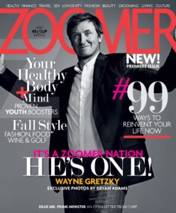
Premiere Issue!
September, 2008: The magazine launches and the Zoomer logo is unveiled to the world. Our first cover features The Great One, Wayne Gretzky, shot by Bryan Adams.

Somewhere In The Middle!
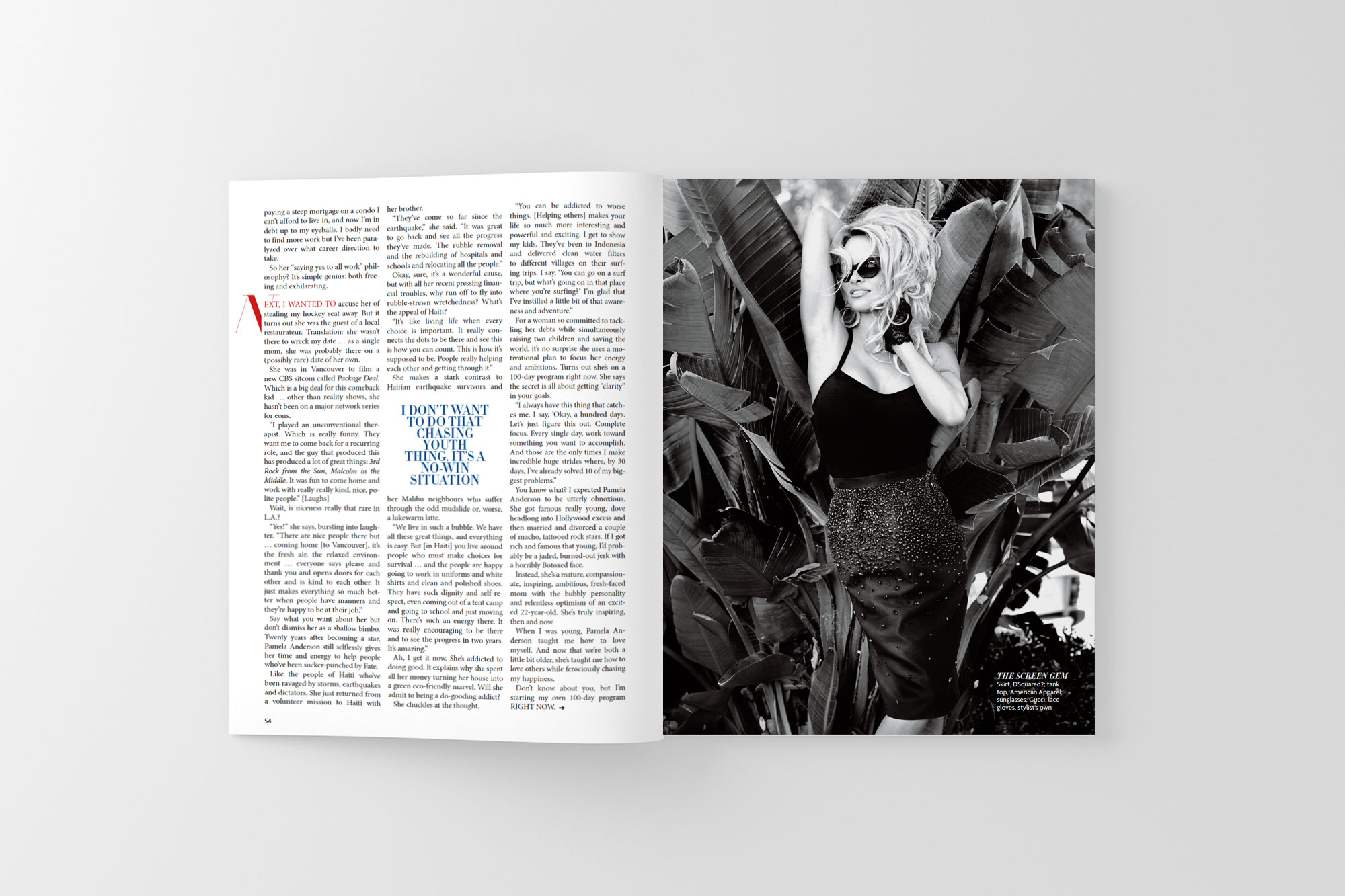
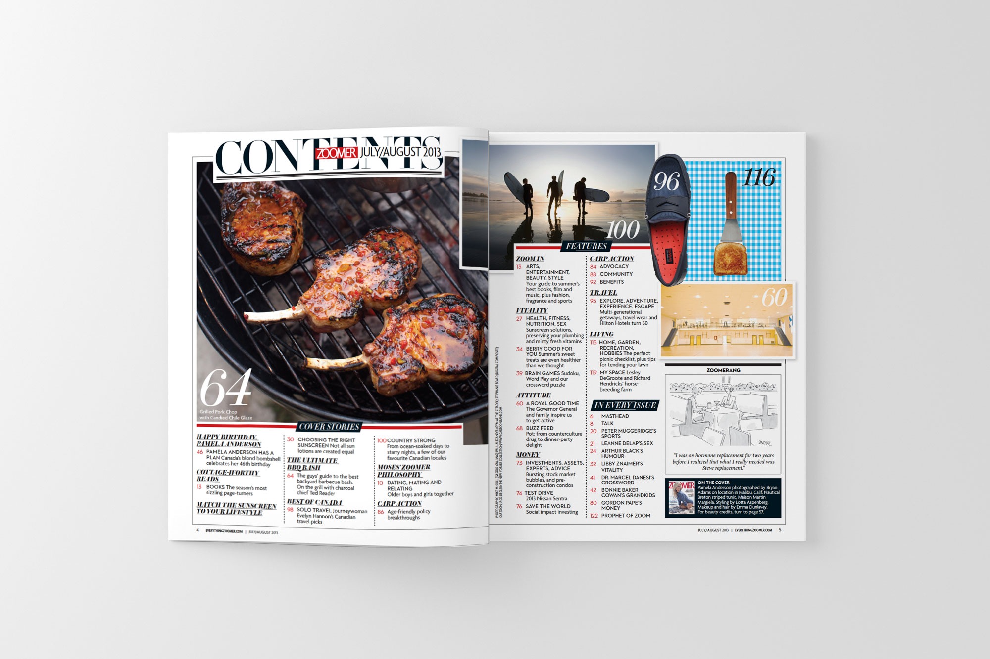
Summer, 2013: Five years later, and Zoomer has caught fire while attracting incredible Canadian talent, such as Bryan Adams photographing Pamela Anderson.
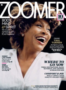
10th Anniversary Issue!
Winter, 2018: Zoomer celebrates 10 years of winning hundreds of awards for their art and design, as well as their humanitarian efforts in support retirees and battling ageism.
Layouts
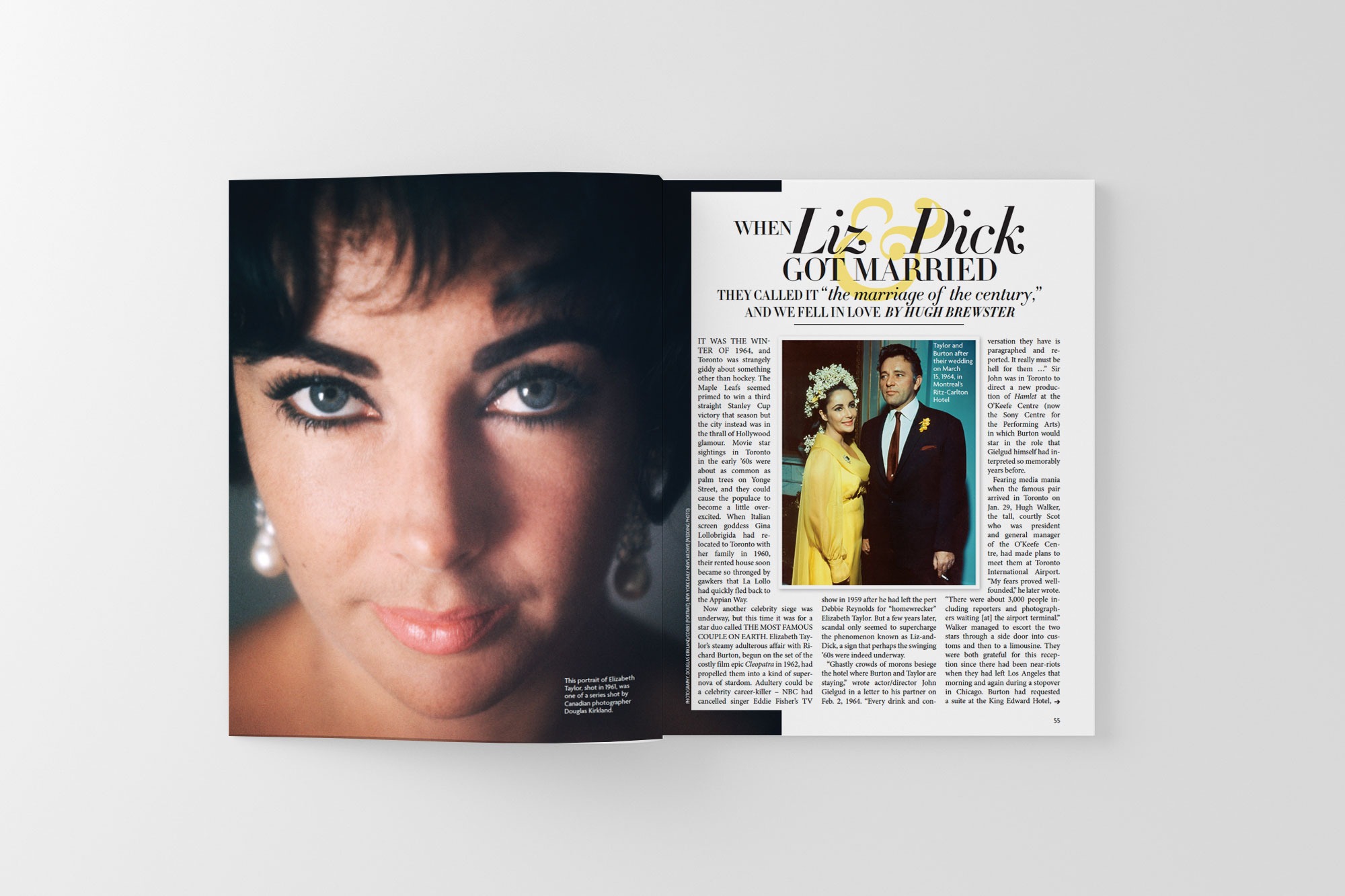
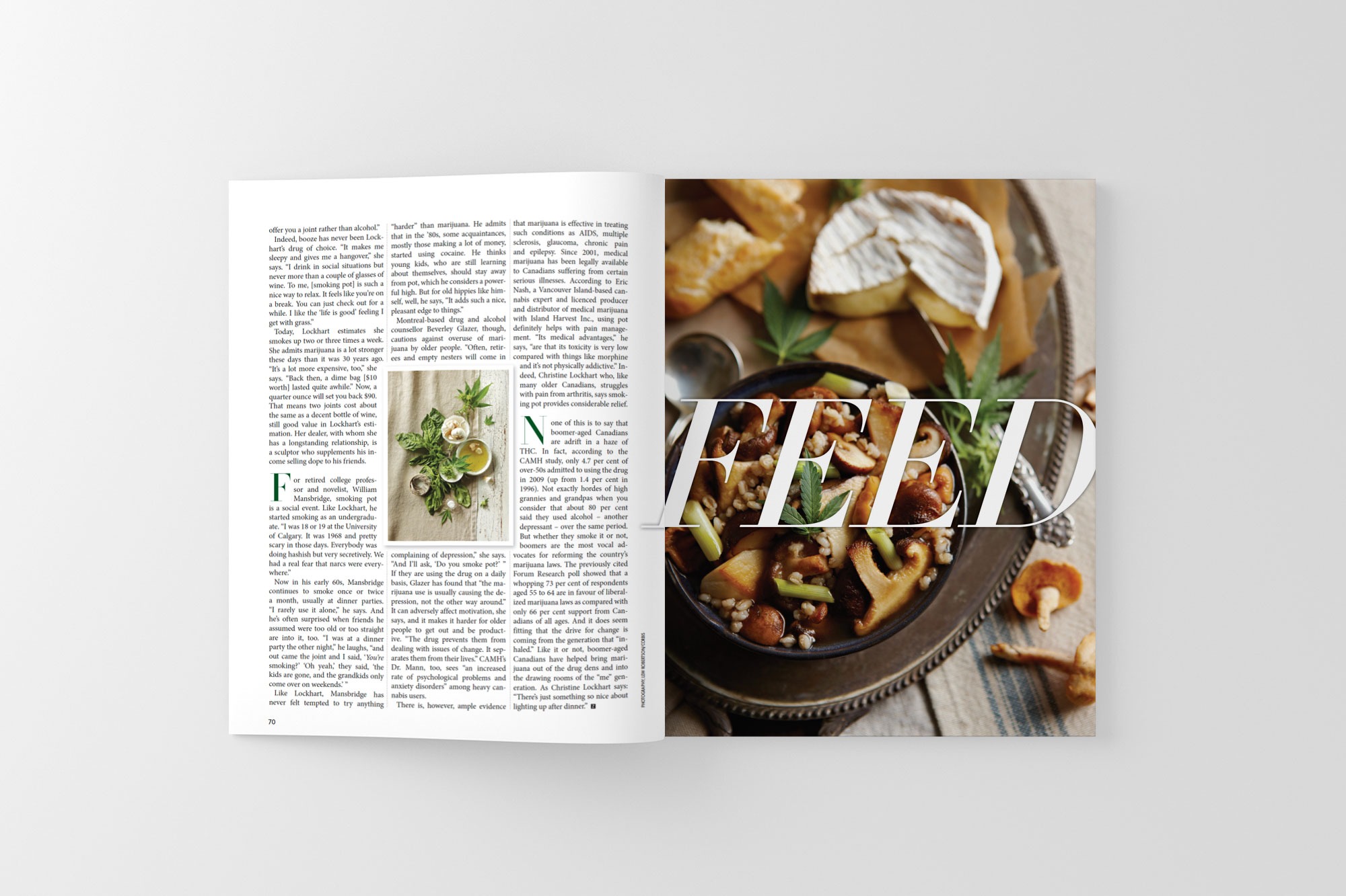
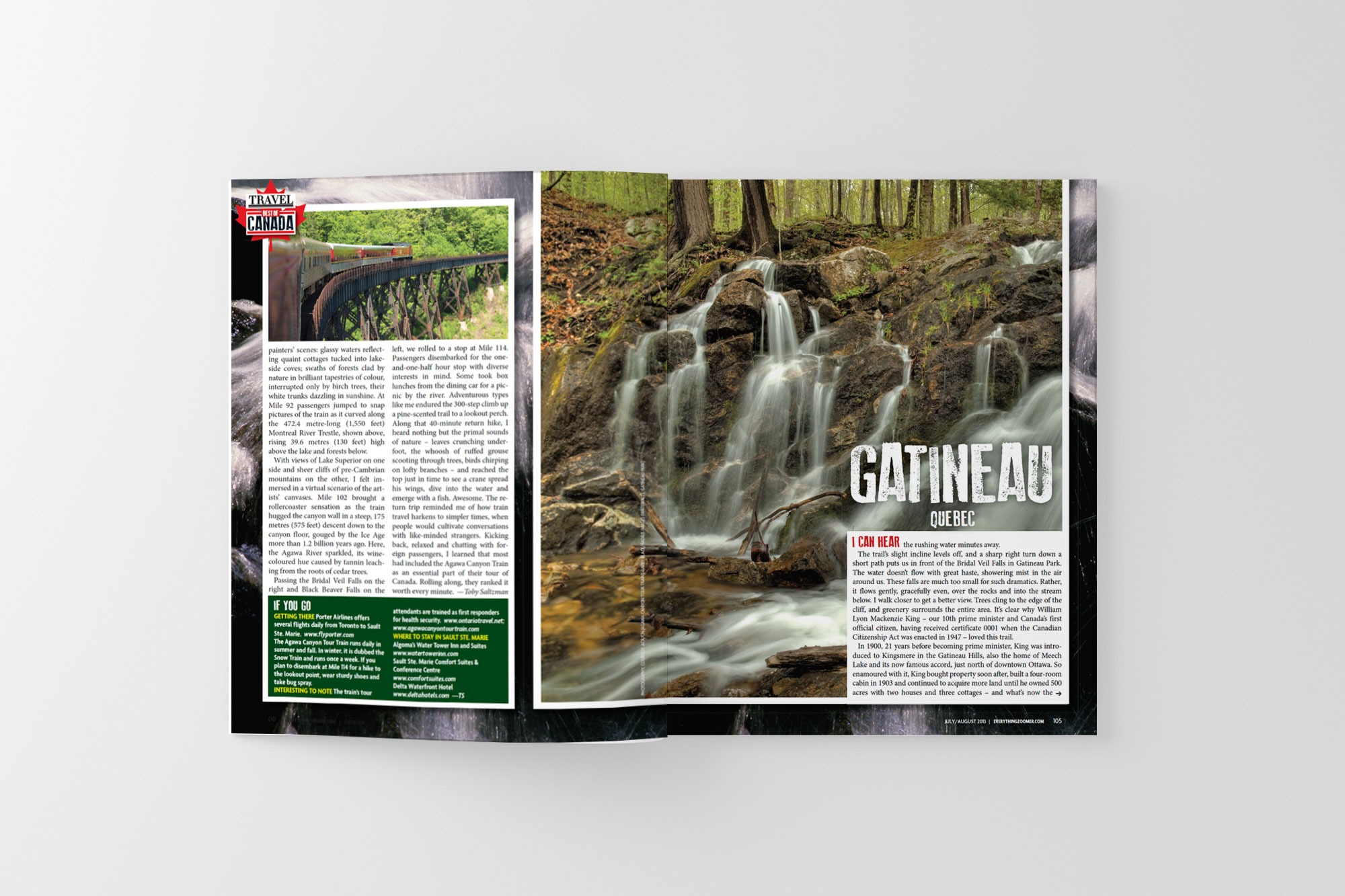
Five years of Art Directing for Zoomer Magazine was a dream! It was the last great magazine launch that we’ll see in our lifetime, thanks to the fall of print publications and the rise of digital. Not a day goes by when we don’t miss w0rking with this phenomenal team — but not a day goes by when we’re thankful we don’t have live in a goddamn uninhabitable, icebox of a city like Toronto, Canada.
The highlight was our Pamela Anderson issue, photographed by Bryan Adams. Truly a showcase of Canadian talent!




Media Kit
